Analysis of Ethereum Transactions using Apache Spark and Hadoop
Aims and Objectives of this project:
- Finding the aggregate transactions each month during years 2015- 2019 and analyse the trends.
- Finding the top 10 Smart Contracts (Addresses that made the largest transactions) that took place during these years.
- Analysing if gas prices has changed over time, or contracts have become more complicated (the amount of gas consumed per transaction has increased or not).
- Finding the most lucrative form of scam taking place in Ethereum community? How does the scam type change throughout time.
1)The first part of Ethereum Historical Data Analysis was to look over the past 4 years of transactions. Here I am using Map Reduce jobs to count the number of transactions taking place in each month of the years 2015 - 2019.
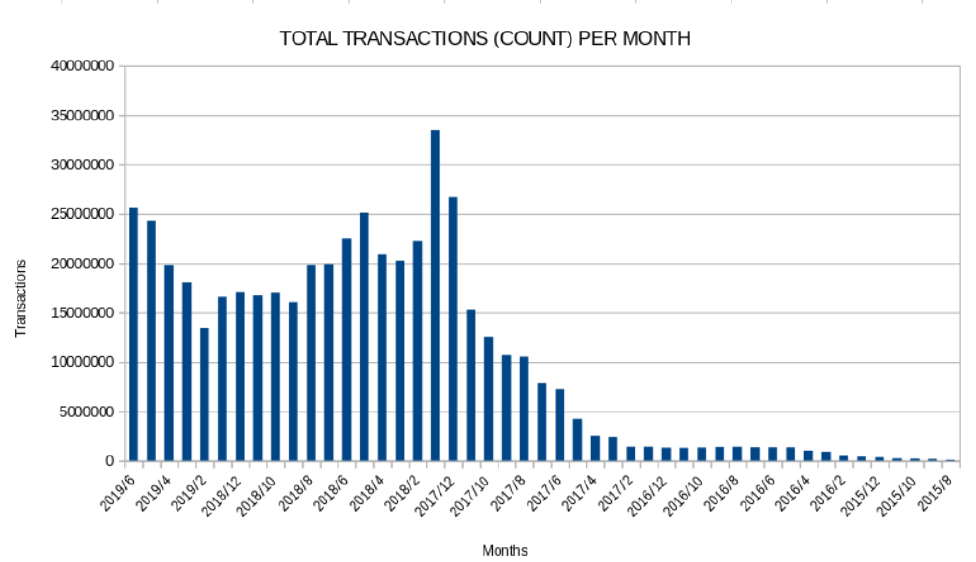
Total transactions happening with time
As we can see from the bar plot above, we can see that the number of transactions were lesser in the years 2015, 2016. In February 2017 we see a gradual increase in transactions, which reached there maximum at January 2018. Following after that, we see a gradual decline in February, March , April , but in May 2018 we see an increase in the transactions. Following after that, we see a decrease in number of transactions until February 2019. Onwards, Ethereum transactions begin to stabilize again as the trend goes upward back again.
2)Top Ten Most Popular Services:
Here I have evaluated the top 10 smart contracts by total Ether received. Here I am focusing on aggregating all the transactions which took place by each address, to see the net transaction sum of each individual address. Using a repartition join between transactions and contracts table, I have made sure that the transactions are Smart Contracts. Later I have aggregated the values of those smart contracts to reveal the top 10 smart contracts.
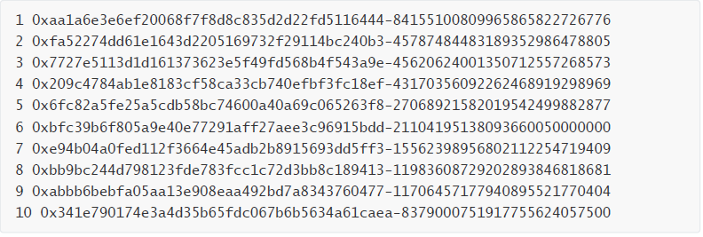
Most popular services
- Gas Guzzler Analysis:
To find out if the gas prices have changed over time, I designed a map reduce job to get the gas prices over time. Using the contracts table. Then I plotted those values with time and analysed the trend.
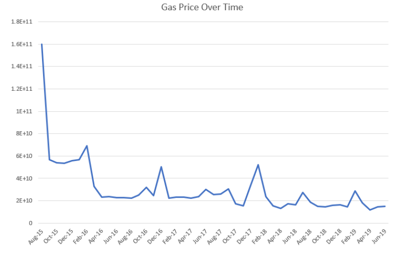
Gas Consumption per time
In August 2015. The value of the gas price was at the highest point. With further months, the gas prices followed a downward trend . Between February and April 2016 the gas prices started increasing again, followed by downward trends in June, July and August 2016. The gas prices started increasing back in December 2016, this surge lasted for 2 months. Followed by stability in prices. In December 2017 the gas prices rose up again, this surge also lasted for just 2 months. The prices are stable until June 2019.
Working out the complexity :
To work out the complexity of our transactions and to see if they have became more complex with time or not. I made a replication join of my top 10 values contracts from Part-B with the transactions table, to find their history of transactions. For each top-10 address, its time-stamp and gas has been yielded.
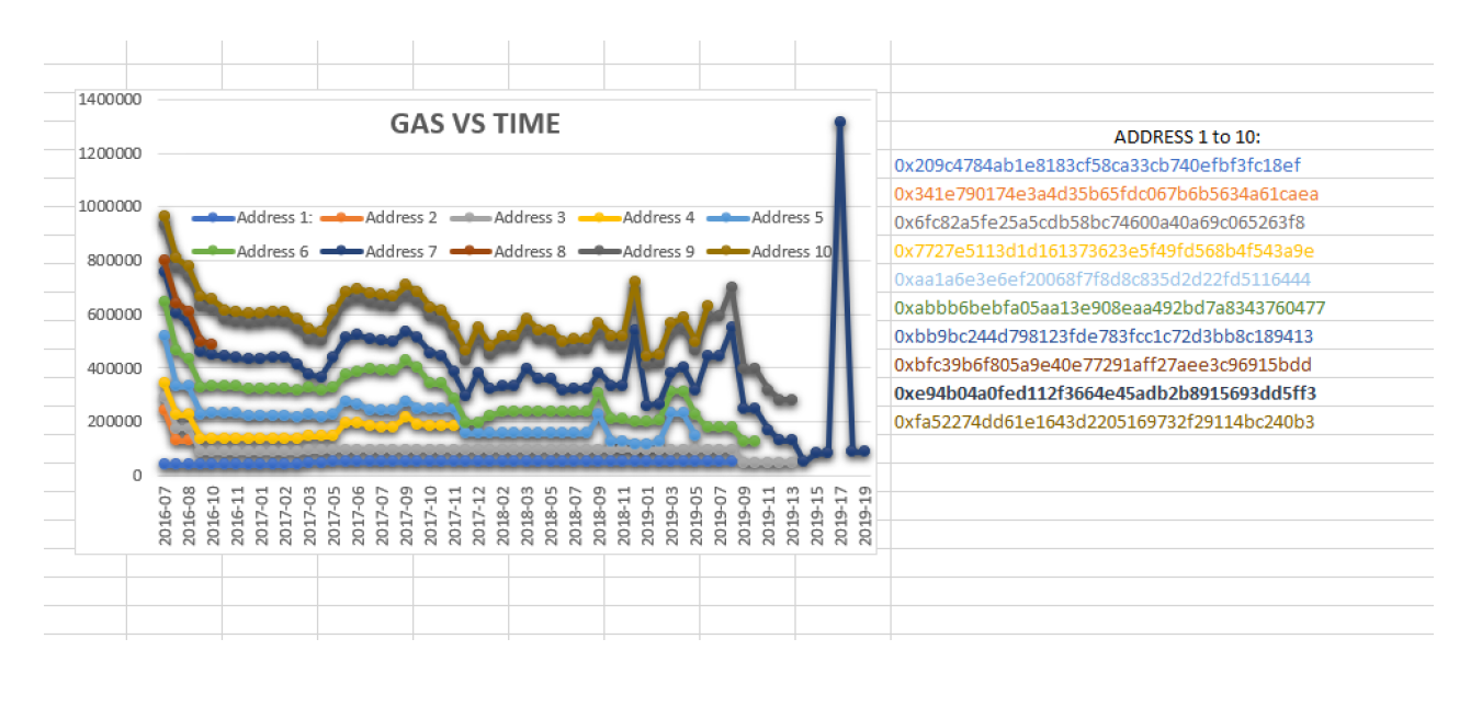
Gas consumption per transaction
- Finding the most lucrative form of scam:
To work out most lucrative form of scams. A replication join would be made between Aggregate of transactions from Part_B job 1 output to the Scams.json file. To see if those addresses were involved in any sort of scams. The next step would be aggregating the scammed contracts with respect to their types and values of scams.
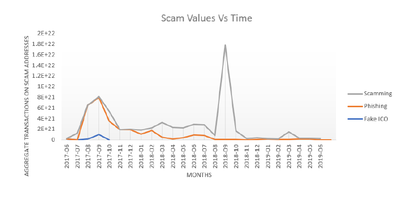
Scams and their trends with time
As it is inferred from the plot above, Fake ICO scam had a really short life span. Getting Initialized in July 2017 and Ending in October 2017. For the Phishing, it was initialized in June 2017, surged up high in September and October of 2017. Scamming initialized in June 2016, surging up high and profiting the most since January 2011. Scamming had its all time high value in September 2018. As seen from the analysis, Scamming remains to be the most lucrative one, over a long period of time.